Medley Burgh
About
Medley Burgh is an educational institute based in Pune. ‘School of Languages and Cultures’ is how they define themselves. Unlike the popular language training institutes, their offering is based on creating a more affectionate bond towards not just a language but also the associated culture.
Industry
Education
Requirement
Previously called ‘School of Languages and Cultures’, they wanted a name and logo that would be unique, memorable but also relevant.
Our solution
After a few detailed discussions with the founders, we had gained clarity on what the institute needed. In an attempt of bringing together all their offerings, we came up with this name. The simple meaning of this name would be, ‘a small place where multiple languages and cultures come togther and thrive’.
Logo Designing
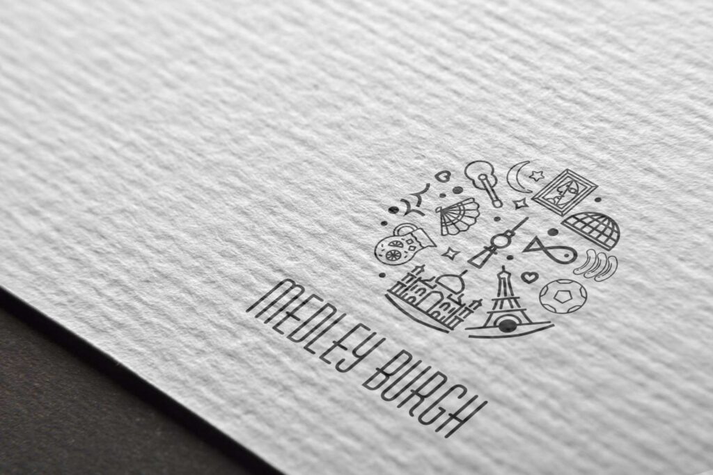
To justify the name, the logo is also designed in a manner that boasts a symbolic representation of various countries. Confined inside an invisible circular border, it also represents the Burgh that constitutes of it all. Aimed at attracting young adults and adults under 30, the colour scheme of the logo is kept multicoloured, illustrative in style and youthful. The font face selected for the name is also a conscious effort to keep the chic feel intact.
Marketing Collaterals
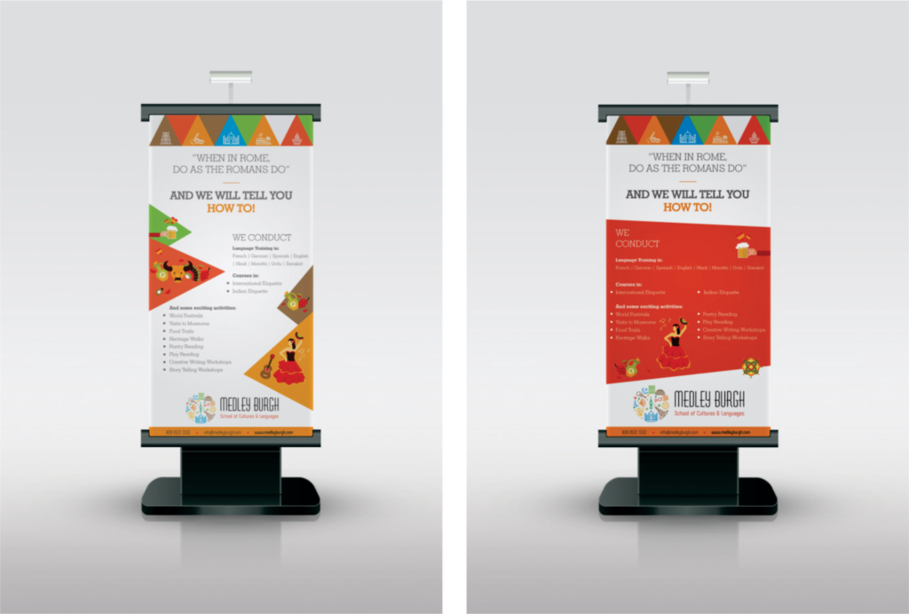
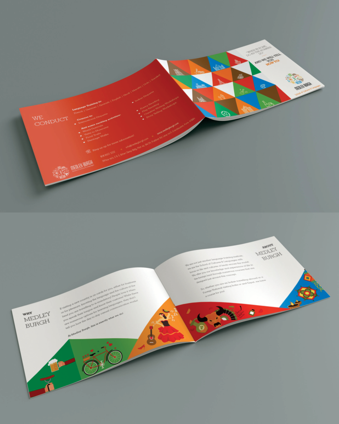
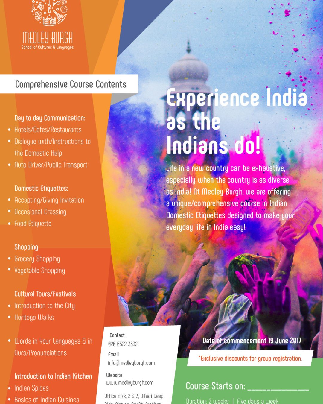
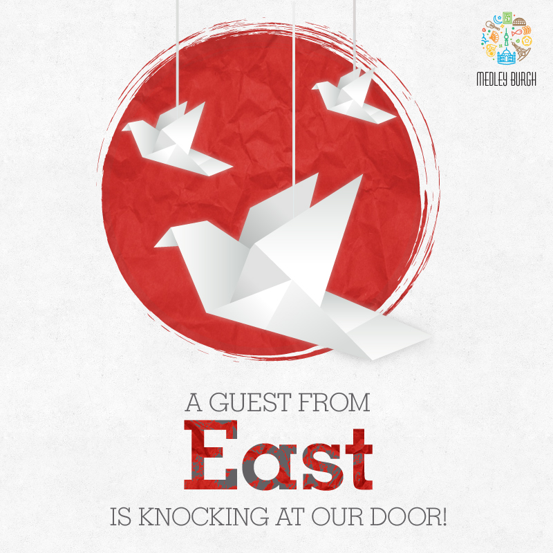
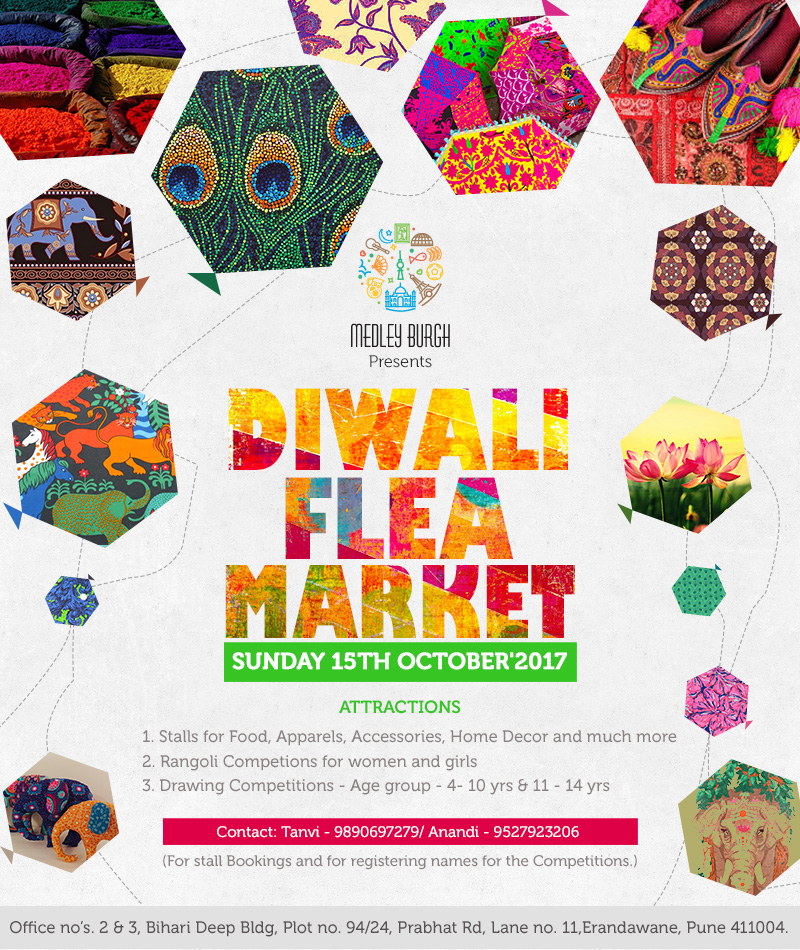
We created the first set of all marketing collaterals for them. This consisted of the stationery, leaflets, brochure, standees as well as social media creatives announcing their launch, courses and other activities.
want to be better?

Building brands tastefully
We are a boutique branding and communications agency with abundant love for breaking stereotypes, being bold & having unusual perspectives.
Blogs
- Security
- Global
- Request

